
A landing page is a crucial component of any online marketing strategy. It serves as the first point of contact between a website and its visitors, with the primary goal of converting these visitors into leads or customers. To ensure an optimal user experience, landing pages need to be designed and optimized for different devices. This is where the concept of responsive design comes into play.
Before diving into the intricacies of responsive design, let’s start by defining what a landing page actually is.
A landing page is a standalone web page that is specifically created to achieve a particular objective. It is distinct from other pages on a website, such as the homepage or blog posts, as it has a singular focus and encourages visitors to take a specific action.
When it comes to designing a landing page, there are several key elements to consider. Firstly, the layout and design should be clean and visually appealing, with a clear call-to-action (CTA) that stands out. This could be a button, a form, or any other element that prompts the visitor to take the desired action.
In addition to the visual elements, the content on a landing page plays a crucial role in its success. The text should be concise, persuasive, and focused on the benefits of the product or service being offered. It should address the pain points of the target audience and provide a solution that is compelling enough to make them want to take action.
The primary purpose of a landing page is to convert visitors into leads or customers. It does this by capturing their attention, presenting relevant information, and enticing them to take a desired action, such as making a purchase, signing up for a newsletter, or filling out a contact form.
One of the key advantages of using a landing page is its ability to target specific audience segments with tailored messages. By creating multiple landing pages that cater to different demographics or interests, businesses can maximize the chances of converting these visitors into leads. For example, a clothing retailer may have separate landing pages for men’s and women’s clothing, each showcasing products and offers that are relevant to the respective target audience.
Another important aspect of landing pages is their role in measuring the effectiveness of marketing campaigns. By directing traffic to a specific landing page, businesses can track the number of visitors, conversions, and other key metrics to assess the success of their campaigns. This data provides valuable insights into the preferences and behaviors of the target audience, allowing businesses to refine their marketing strategies and optimize their conversion rates.
In conclusion, landing pages are a powerful tool for businesses looking to drive conversions and measure the effectiveness of their marketing efforts. By understanding the basics of a landing page and implementing best practices in design and content, businesses can create compelling and persuasive experiences that motivate visitors to take action.
Now that we have a solid understanding of what landing pages are, let’s explore the concept of responsive design.
Responsive design refers to the approach of designing and developing web pages that automatically adapt to different screen sizes and devices. With the increasing use of smartphones and tablets, it has become essential for websites to be accessible and usable across multiple platforms.
When we talk about responsive design, we are not just referring to making a website “mobile-friendly.” It goes beyond that. Responsive design aims to provide an optimal user experience regardless of the device being used. Whether it’s a small smartphone screen or a large desktop monitor, responsive design ensures that the website looks and functions well.
Responsive design achieves this adaptability by using flexible images, fluid grids, and CSS media queries to ensure that the website’s layout and content adjust dynamically to match the user’s device. The use of flexible images allows them to resize and scale proportionally, ensuring that they fit perfectly within the available screen space. Fluid grids, on the other hand, enable the website’s layout to adjust and rearrange its elements based on the screen size, providing a consistent and visually pleasing experience.
Another important aspect of responsive design is the use of CSS media queries. Media queries allow developers to apply different styles and rules to a website based on the characteristics of the user’s device. This means that specific styles can be applied to smartphones, tablets, and desktops, ensuring that the website looks and functions optimally on each device.
Mobile usage has been steadily increasing over the past decade, and it has now surpassed desktop usage in many countries. This shift in user behavior means that businesses must embrace responsive design to provide a seamless and enjoyable browsing experience for their visitors across all devices.
When a website is not responsive, users accessing it from a mobile device may encounter issues such as text that is too small to read, buttons that are difficult to tap, or content that is cut off and requires horizontal scrolling. These issues can frustrate users and lead to high bounce rates, negatively impacting the website’s performance.
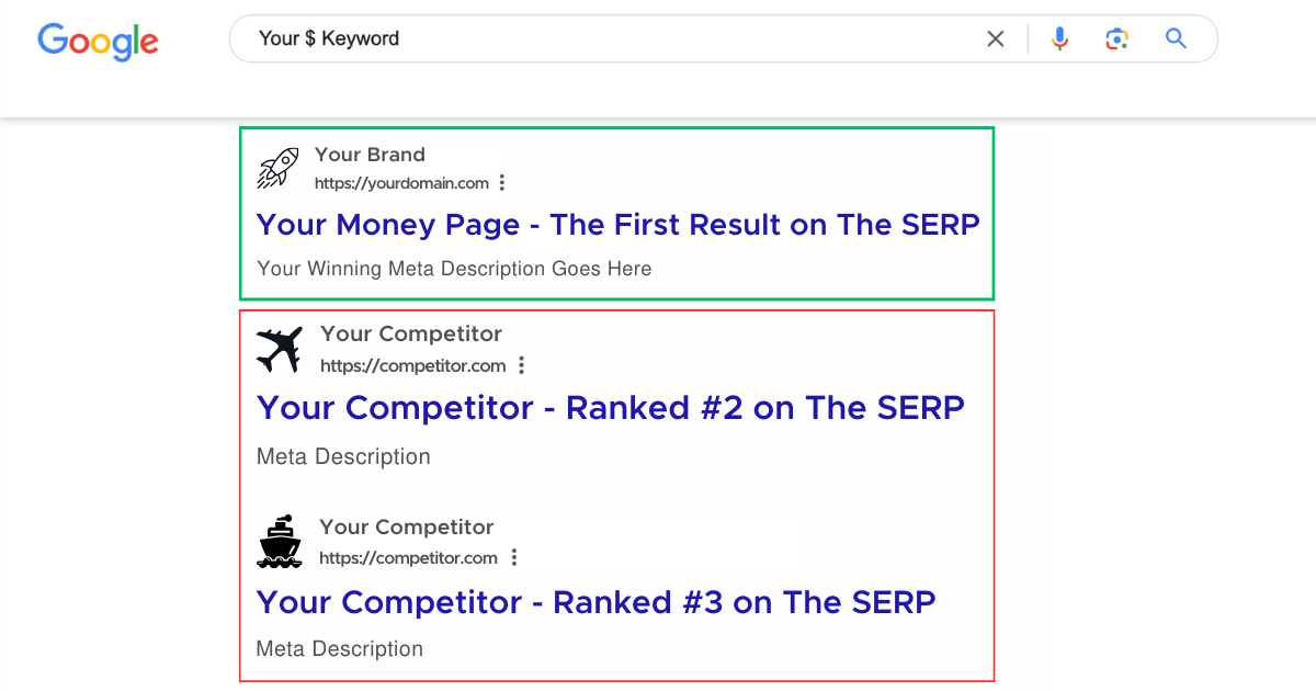
Furthermore, search engines like Google prioritize mobile-friendly websites in their search engine result pages (SERPs). This means that if a website is not responsive, it may not rank as high in search results, resulting in lower visibility and less organic traffic.
By implementing responsive design, websites can improve their search engine rankings and drive more organic traffic to their landing pages. Additionally, responsive design allows businesses to reach a wider audience and cater to the needs of users who prefer to browse the internet on their mobile devices.
In conclusion, responsive design is not just a trend; it is a necessity in today’s digital landscape. It ensures that websites are accessible, usable, and visually appealing across various devices, ultimately enhancing the user experience and driving business success.
Now that we understand the individual components, let’s explore how landing pages and responsive design intersect, and the benefits it brings.
Landing pages are specifically designed to encourage visitors to take a particular action. However, if these pages are not optimized for mobile devices, they may fail to deliver a seamless user experience, resulting in high bounce rates and low conversion rates.
By integrating responsive design principles into landing page development, businesses can ensure that their pages are accessible and visually appealing on any device, increasing the chances of conversion.
Responsive design enhances landing pages in several ways. Firstly, it ensures that the layout and content adapt to fit the smaller screens of smartphones and tablets, eliminating the need for visitors to constantly pinch and zoom, resulting in a more user-friendly experience.
Secondly, responsive design guarantees that the call-to-action buttons and forms on a landing page are easily tappable and fillable on touchscreens, removing any friction from the conversion process.
To create an effective responsive landing page, there are several key elements that need to be considered. Let’s explore them in detail below.
When designing a responsive landing page, it’s crucial to consider how the layout, typography, and images will appear on various devices. This may involve tweaking the design to ensure that it remains visually appealing and easy to navigate, regardless of screen size.
Visual elements should be optimized for quick loading times on mobile networks, as slow load times can significantly impact user experience and conversion rates.
Users have little patience for slow-loading pages, particularly on mobile devices. To ensure a positive user experience and to keep visitors engaged, landing pages should be optimized for quick load times. This can be achieved by compressing images, minifying code, and leveraging browser caching.
Navigation is a crucial element of any website, including landing pages. On larger screens, navigation menus may be displayed horizontally, while on smaller screens, a collapsible or hidden menu is recommended to maximize available screen space.
Clear navigation ensures that visitors can easily navigate between different sections of a landing page, enhancing user experience and increasing the chances of conversion.
Responsive landing pages offer numerous benefits that can positively impact a business’s online presence. Let’s explore some of the key advantages below.
A responsive landing page provides a consistent and user-friendly experience across all devices. Visitors can effortlessly access and interact with the page, without having to zoom in or scroll horizontally. This seamless user experience encourages engagement and increases the likelihood of conversions.
By optimizing landing pages for different devices, businesses can remove any barriers that may hinder visitors from taking the desired action. Responsive design ensures that call-to-action buttons and forms are easily accessible, improving the chances of conversion and driving more leads or customers to the business.
Responsive landing pages can positively impact search engine optimization (SEO) efforts. Google, for instance, considers mobile-friendliness as a ranking factor in its search algorithms. By implementing responsive design, websites can improve their search engine ranking, resulting in increased visibility and organic traffic to their landing pages.
In today’s mobile-first world, responsive design is no longer optional but essential for online success. Landing pages, being critical conversion tools, must adapt to various devices through responsive design to provide an optimal user experience and maximize conversion rates. By incorporating the key elements of responsive design into landing page development, businesses can enhance user engagement, improve conversions, and reap the benefits of improved search engine visibility. So, if you haven’t already, it’s time to invest in creating responsive landing pages to stay competitive in the digital landscape.

Walter Voronovic shares accurate, honest & pragmatic information on how to use the internet to build profitable digital business assets.